Discuss Scratch

- Discussion Forums
- » Suggestions
- » Default Icon Ideas!
![[RSS Feed]](//mv-ezproxy-com.ezproxyberklee.flo.org/scratchr2/static/__35b9adb704d6d778f00a893a1b104339__//djangobb_forum/img/feed-icon-small.png "[RSS Feed]")
- blablablahello
-
 Scratcher

1000+ posts
Default Icon Ideas!
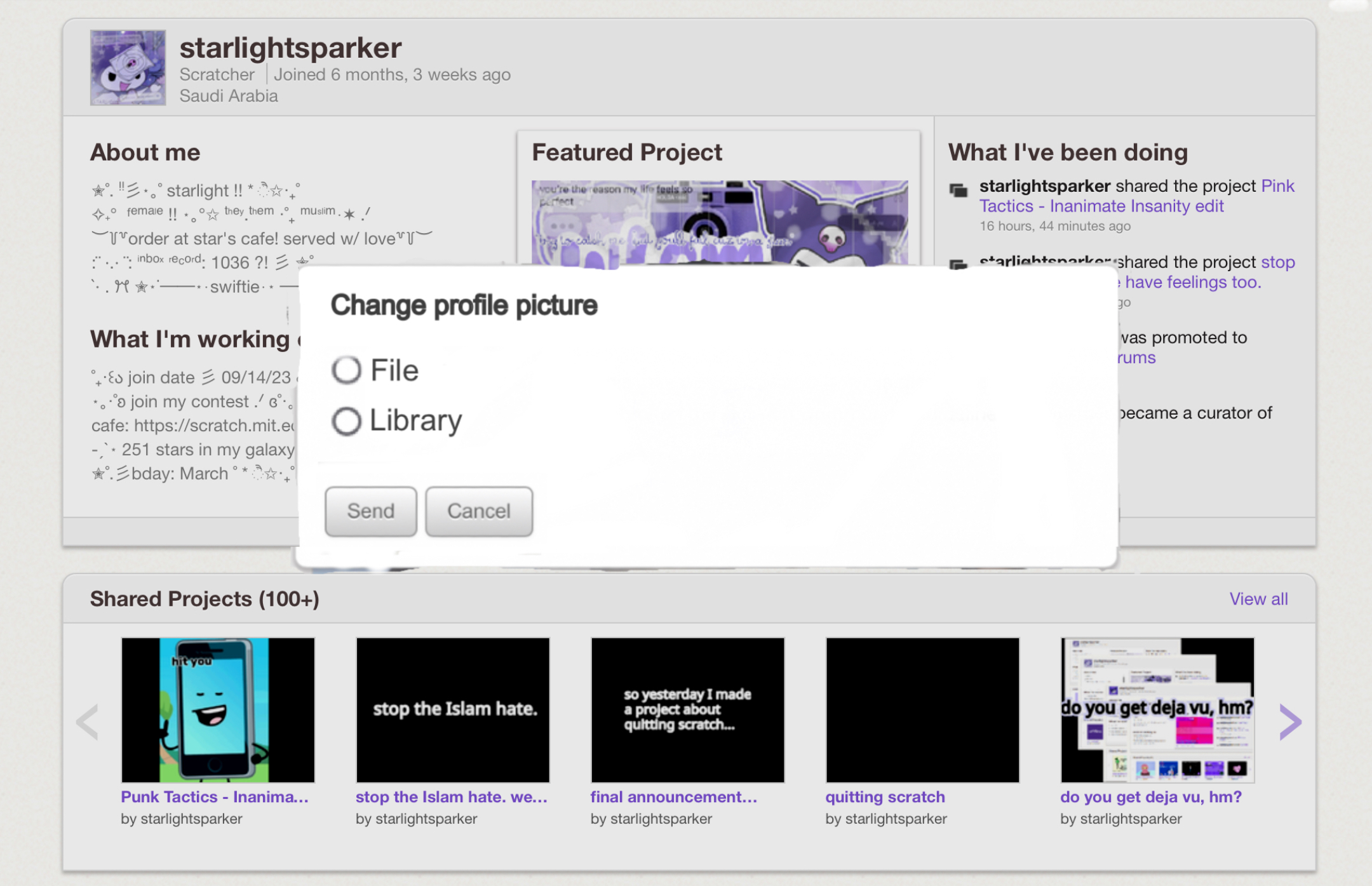
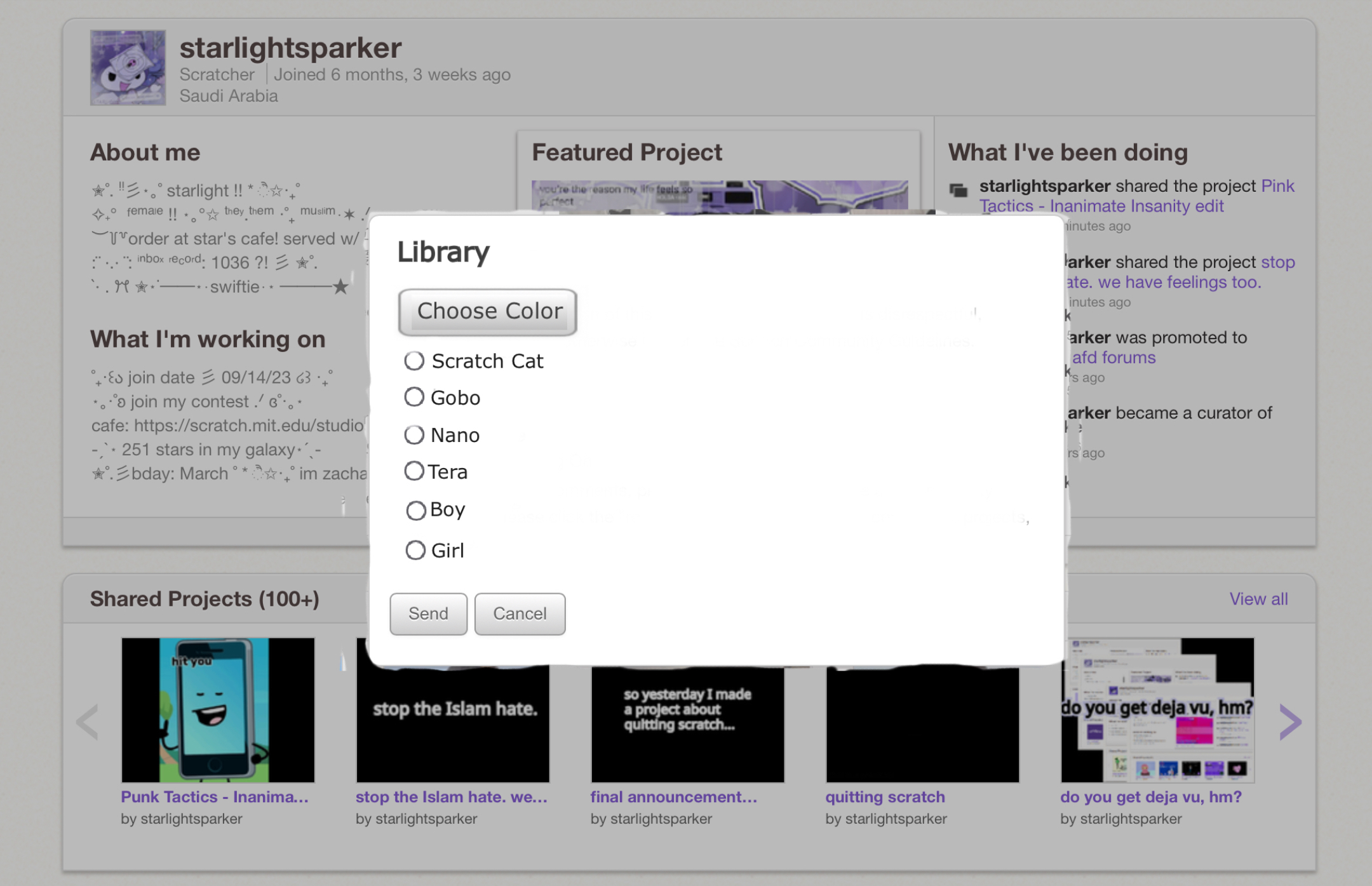
I joined scratch in 2023 I saw the Characteres Pfp there's scratch and nano pico and giga and tera and gobo there look differentThose are made by scratchers, not provided by scratch


- KiamTheHedgehog2023
-
 Scratcher

3 posts
Default Icon Ideas!
Those Pfp Are familiar to the Scratchers that I forgotten Profile Pictures
play note ( v) for (0.5) beats
when green flag clicked
repeat (10)

end


- DangerPuppy10
-
 Scratcher
1000+ posts
Default Icon Ideas!
This post was closed by accident, and has been reopened!
- LP372
-
 Scratcher
1000+ posts
Default Icon Ideas!
This post was closed by accident, and has been reopened!mine was closed for being a ‘dupe’ of this.

- emmet19913
-
 Scratcher

10 posts
Default Icon Ideas!
I was looking for random discusses and found this and I joined for no reason
when green flag clicked
say [hi]
Last edited by emmet19913 (April 7, 2024 02:19:55)
- emmet19913
-
Scratcher
10 posts
Default Icon Ideas!
https://scratch-mit-edu.ezproxyberklee.flo.org/projects/996512729
recreations and concepts of default pfps
recreations and concepts of default pfps
when green flag clicked
if <(linkpressed?) = [yes]> then
open link
Last edited by emmet19913 (April 7, 2024 03:36:44)
- WallydogChoppychop
-
 Scratcher

500+ posts
Default Icon Ideas!
Oh no…
Scratch said they will not change the scratch cat design because it is too iconic.Citation needed but… Maybe you could get away by keeping the cat icon the same?
- Nova1789
-
 Scratcher

40 posts
Default Icon Ideas!
Support.1000% agree, blue cats is really boring.
I made a mockup of the icons idea a while ago - the icons come from this project:
it would also allow you to upload one from your computer when you sign up, that way there would be less people with default icons.
- emmet19913
-
Scratcher
10 posts
Default Icon Ideas!
the “blue cat” pfp was way different back then.
Source: https://en.scratch-wiki.info/wiki/User_Icon
It was more high quality,
looked more like a human.
Source: https://en.scratch-wiki.info/wiki/User_Icon
It was more high quality,
looked more like a human.
Last edited by emmet19913 (April 7, 2024 20:15:50)
- Nova1789
-
Scratcher
40 posts
Default Icon Ideas!
the “blue cat” pfp was way different back then.Agree lol
Source: https://en.scratch-wiki.info/wiki/User_Icon
It was more high quality,
looked more like a human.
- PokePika__10339__
-
 Scratcher

500+ posts
Default Icon Ideas!
Put Some Color In That Cat!While I like this idea, I think we should still keep the original Scratch cat profile. Maybe the profiles could look something like this?
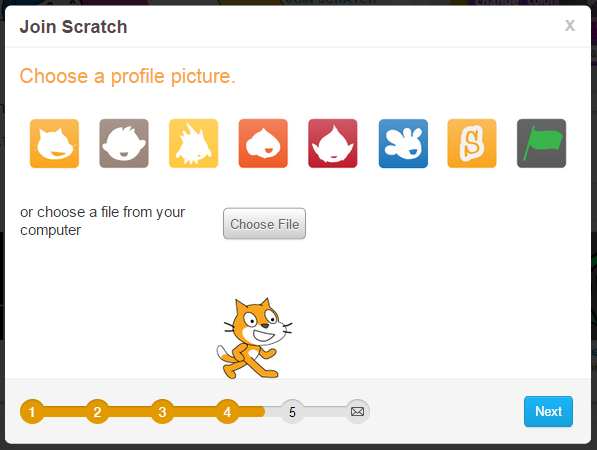
When you first make an account on Scratch, you get this boring…… gray…… bleh icon that is very unappealing to the human eye. I suggest that the ST puts some color in the Scratch Cat, making it its usual colors. It would be more attractive.
Cats, and Gobos, and Gigas, oh my!
When you first make a Scratch account, you get this cat. The silhouette of the Scratch Cat. My idea is that when you make an account, you must choose if you want the silhouette of a cat, a nano, a gobo, a giga, a terra, etc. It would put a bit more spice and diversity into Scratch!
These are just ideas. Feel free to give feedback.
Thanks!

- emmet19913
-
Scratcher
10 posts
Default Icon Ideas!
I didn’t say that it was better, but ok.the “blue cat” pfp was way different back then.Agree lol
Source: https://en.scratch-wiki.info/wiki/User_Icon
It was more high quality,
looked more like a human.
when green flag clicked
say [im cool]
Last edited by emmet19913 (Dec. 19, 2024 10:03:10)
- Discussion Forums
- » Suggestions
-
» Default Icon Ideas!