Discuss Scratch

- chippysmall4
-
 Scratcher

1000+ posts
The Sunglow Color Scheme
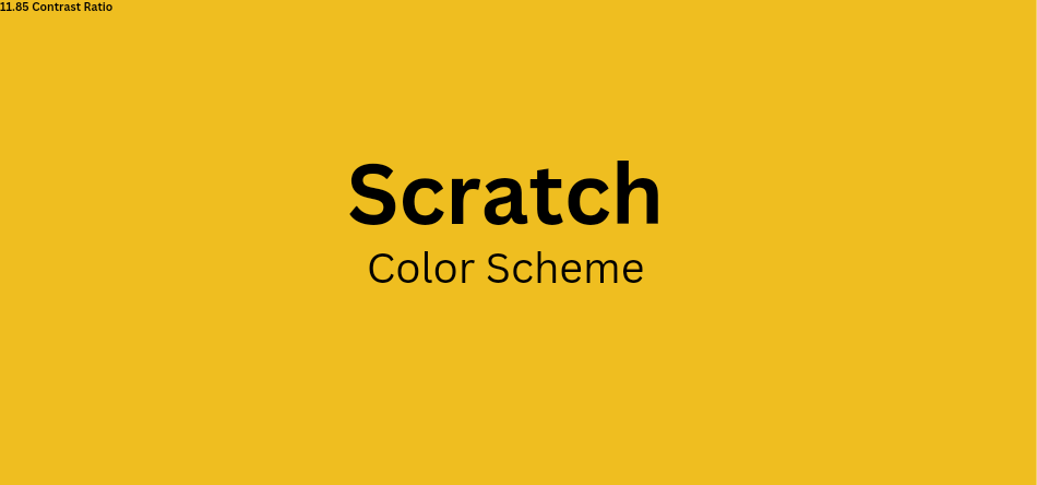
Scratch Changed It's Color Scheme From Blue To Purple To Improve Color Contrast.
This Is Suggesting A New Color Scheme For Scratch.
-The Yellow-Abyss Color Scheme-
1. Why?
The Contrast Ratio Of The Color #EFBE20 To The Color #02001A Is 11.85 source As Opposed To The Current Purple's 4.66.
This Would Make Scratch More Accessible.
2. A Mockup Of A Forum Page With The Color Scheme.

Colors Used :
Text - #02001A
Background - #EFBE20
Last edited by chippysmall4 (March 1, 2024 11:05:55)
- hydrofungus
-
 Scratcher

1000+ posts
The Sunglow Color Scheme
Yes yellow and black has a great color contrast, but
1. I place a twenty dollar bet it would cause more drama and controversy. So soon after the blue and purple war.
2. Scratch would have to rework their logo
3. Some might get attacked by the yellow navbar and white background, those 2 don’t mix. I swear. Especially those who use scratch at night (remember dark mode is currently addon-exclusive and not everyone can use addons).
- chippysmall4
-
Scratcher
1000+ posts
The Sunglow Color Scheme
Yes yellow and black has a great color contrast, butThe Logo Will Not Be Changed [It Looks Fine With The Color]
1. I place a twenty dollar bet it would cause more drama and controversy. So soon after the blue and purple war.
2. Scratch would have to rework their logo
3. Some might get attacked by the yellow navbar and white background, those 2 don’t mix. I swear. Especially those who use scratch at night (remember dark mode is currently addon-exclusive and not everyone can use addons).
- Malicondi
-
 Scratcher

1000+ posts
The Sunglow Color Scheme
the logo would blend in the with the site. Using scratches current color scheme, the yellow of the logo would blend into the nav bar and other areas of scratch, also i dont want my eyes to be disintegrated with the bright color scheme.Yes yellow and black has a great color contrast, butThe Logo Will Not Be Changed [It Looks Fine With The Color]
1. I place a twenty dollar bet it would cause more drama and controversy. So soon after the blue and purple war.
2. Scratch would have to rework their logo
3. Some might get attacked by the yellow navbar and white background, those 2 don’t mix. I swear. Especially those who use scratch at night (remember dark mode is currently addon-exclusive and not everyone can use addons).
- hydrofungus
-
Scratcher
1000+ posts
The Sunglow Color Scheme
*ahem*2. Scratch would have to rework their logoThe Logo Will Not Be Changed [It Looks Fine With The Color]
As you can see, the logo’s outline is currently white, and i don’t need a visibility checker to know that yellow and white probably has one of the most poor contrast. This could make people strain to look at it, and the orange color in the “Scratch” letters, looks quite close to the color you are suggesting, which might cause even more straining. People do look at logos sometimes.
Last edited by hydrofungus (Feb. 29, 2024 12:16:46)
- chippysmall4
-
Scratcher
1000+ posts
The Sunglow Color Scheme
The Quotes Are All Mixed*ahem*2. Scratch would have to rework their logoThe Logo Will Not Be Changed [It Looks Fine With The Color]
As you can see, the logo’s outline is currently white, and i don’t need a visibility checker to know that yellow and white probably has one of the most poor contrast. This could make people strain to look at it, and the orange color in the “Scratch” letters, looks quite close to the color you are suggesting, which might cause even more straining. People do look at logos sometimes.
As Of Now, The Logo Is Outdated[ So It Would Be Reworked Eventually.
- hydrofungus
-
Scratcher
1000+ posts
The Sunglow Color Scheme
3.0 logoAs Of Now, The Logo Is Outdated[ So It Would Be Reworked Eventually.
*insert vine boom*
And i do not think the logo would be reworked soon, at least when the rest of the site is 3.0’ed half the web is outdated btw
Last edited by hydrofungus (Feb. 29, 2024 12:20:35)
- chippysmall4
-
Scratcher
1000+ posts
The Sunglow Color Scheme
The Quotes Are Mixed Again3.0 logoAs Of Now, The Logo Is Outdated[ So It Would Be Reworked Eventually.
*insert vine boom*
And i do not think the logo would be reworked soon, at least when the rest of the site is 3.0’ed half the web is outdated btw
Some Of The Sites Are Abandoned Which Is Why They Are Outdated
This Wouldn't Be Added Soon Either, And Maybe This Could Be Added Along With The Reworking.
- hydrofungus
-
Scratcher
1000+ posts
The Sunglow Color Scheme
The Quotes Are Mixed AgainIs the forum and scratch profile stuff abandoned? I think not.
Some Of The Sites Are Abandoned Which Is Why They Are Outdated
This Wouldn't Be Added Soon Either, And Maybe This Could Be Added Along With The Reworking.
And how will the logo be changed? Don’t forget, this isn’t just changing the 2.0, it has got to work with 3.0 logo too. And don’t forget reason #3 mentioned in my post above.
- chippysmall4
-
Scratcher
1000+ posts
The Sunglow Color Scheme
The Quotes Are Mixed AgainIs the forum and scratch profile stuff abandoned? I think not.
Some Of The Sites Are Abandoned Which Is Why They Are Outdated
This Wouldn't Be Added Soon Either, And Maybe This Could Be Added Along With The Reworking.
And how will the logo be changed? Don’t forget, this isn’t just changing the 2.0, it has got to work with 3.0 logo too. And don’t forget reason #3 mentioned in my post above.
The Quotes Are Mixed Again3.0 logoAs Of Now, The Logo Is Outdated[ So It Would Be Reworked Eventually.
*insert vine boom*
And i do not think the logo would be reworked soon, at least when the rest of the site is 3.0’ed half the web is outdated btw
Some Of The Sites Are Abandoned Which Is Why They Are Outdated
This Wouldn't Be Added Soon Either, And Maybe This Could Be Added Along With The Reworking.
Last edited by chippysmall4 (Feb. 29, 2024 12:38:13)
- hydrofungus
-
Scratcher
1000+ posts
The Sunglow Color Scheme
Fine. Now let’s talk about
3. Some might get attacked by the yellow navbar and white background, those 2 don’t mix. I swear. Especially those who use scratch at night (remember dark mode is currently addon-exclusive and not everyone can use addons).this.
- plutopawzz
-
 Scratcher

38 posts
The Sunglow Color Scheme
⭐ ;; while yes yellow and black contrast well, what about white? a majority of the site is white (or offwhite) and those colors don't really mix well
- Maximouse
-
 Scratcher

1000+ posts
The Sunglow Color Scheme
Assuming that the background of the page would stay white, what color would be used for links? Yellow is unreadable on white and black would be too similar to normal text.
- chippysmall4
-
Scratcher
1000+ posts
The Sunglow Color Scheme
Assuming that the background of the page would stay white, what color would be used for links? Yellow is unreadable on white and black would be too similar to normal text.A Shade Of Yellow -
#EFBE20
Or
The Blue Used Commonly In Links On Most Parts Of The Internet.
- Maximouse
-
Scratcher
1000+ posts
The Sunglow Color Scheme
Assuming that the background of the page would stay white, what color would be used for links? Yellow is unreadable on white and black would be too similar to normal text.A Shade Of Yellow -
#EFBE20
Or
The Blue Used Commonly In Links On Most Parts Of The Internet.
Even if links were blue for better contrast, buttons – which also need to be clearly visible – have to be yellow if you want the color scheme to be consistent.
Last edited by Maximouse (Feb. 29, 2024 15:28:38)
- starlightsparker
-
 Scratcher

1000+ posts
The Sunglow Color Scheme
No support.
1. It wouldn’t contrast with the scratch logo
2. Purple is arguably better then yellow
3. People have already adjusted to purple, changing it to yellow would just start another war.
4. A lot of people still prefer purple over yellow
5. Purple is higher contrast then yellow
6. Unnecessary, it’s already changed to purple and scratch wouldn’t wanna change brand colors AGAIN
7. Alas, in my opinion… yellow is odd and purple looks better
- chippysmall4
-
Scratcher
1000+ posts
The Sunglow Color Scheme
No support.
1. It wouldn’t contrast with the scratch logo
2. Purple is arguably better then yellow
3. People have already adjusted to purple, changing it to yellow would just start another war.
4. A lot of people still prefer purple over yellow
5. Purple is higher contrast then yellow
6. Unnecessary, it’s already changed to purple and scratch wouldn’t wanna change brand colors AGAIN
7. Alas, in my opinion… yellow is odd and purple looks better
-snip-Sunglow On Abyss Is 11.85 Contrast Ratio, More Than Purple, As Stated In The OP.
Some Of The Sites Are Abandoned Which Is Why They Are Outdated
This Wouldn't Be Added Soon Either, And Maybe This Could Be Added Along With The Reworking.
- MythosLore
-
 Scratcher

1000+ posts
The Sunglow Color Scheme
With the way that many users complained about the header becoming a color somewhat similar to blue and already used on Looks blocks, there will probably be even more complaints when the header becoming the color of mustard.
There's also the fact that neither of the colors are shown anywhere on the site.
Also, keep in mind that actual black (#000000) text (or something extremely similar to it, like the color you suggested) can cause eye strain and make text hard to look at for a while. More contrast does not always mean better.
- starlightsparker
-
Scratcher
1000+ posts
The Sunglow Color Scheme
Still. My other points standNo support.
1. It wouldn’t contrast with the scratch logo
2. Purple is arguably better then yellow
3. People have already adjusted to purple, changing it to yellow would just start another war.
4. A lot of people still prefer purple over yellow
5. Purple is higher contrast then yellow
6. Unnecessary, it’s already changed to purple and scratch wouldn’t wanna change brand colors AGAIN
7. Alas, in my opinion… yellow is odd and purple looks better-snip-Sunglow On Abyss Is 11.85 Contrast Ratio, More Than Purple, As Stated In The OP.
Some Of The Sites Are Abandoned Which Is Why They Are Outdated
This Wouldn't Be Added Soon Either, And Maybe This Could Be Added Along With The Reworking.
- XCartooonX
-
 Scratcher

500+ posts
The Sunglow Color Scheme
This color scheme would hurt the eyes of so, so many people. No support.
Having a better contrast ratio doesn't mean it's a better color choice. The purple is a lot nicer.
Having a better contrast ratio doesn't mean it's a better color choice. The purple is a lot nicer.