Discuss Scratch

- Discussion Forums
- » Bugs and Glitches
- » Color Consistiencies in Accessibility Update List
![[RSS Feed]](//mv-ezproxy-com.ezproxyberklee.flo.org/scratchr2/static/__35b9adb704d6d778f00a893a1b104339__//djangobb_forum/img/feed-icon-small.png "[RSS Feed]")
- 8to16
-
 Scratcher

1000+ posts
Color Consistiencies in Accessibility Update List
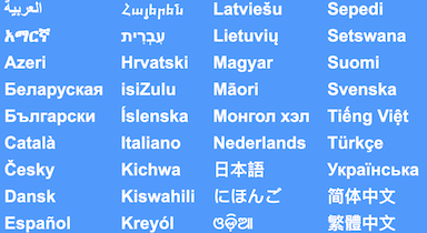
This is a really small one, but the languages image in the About page is still blue
(Had to host the image myself because apparently scratch itself is blocked by the image host whitelist)
(Had to host the image myself because apparently scratch itself is blocked by the image host whitelist)
- kahoot_player21
-
 Scratcher

500+ posts
Color Consistiencies in Accessibility Update List
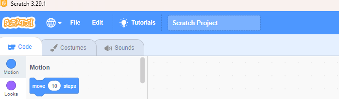
insert the stuff hereI don't know who uses the offline scratch editor, but the top bar on there is still blue, including all of the other places the purple-ish color is used.
- han614698
-
 Scratcher

1000+ posts
Color Consistiencies in Accessibility Update List
(#243)The offline editor hasn't been updated - probably on purpose.insert the stuff hereI don't know who uses the offline scratch editor, but the top bar on there is still blue, including all of the other places the purple-ish color is used.
[img]https://u.cubeupload.com/buenanana/78cScreenshot2024111220.png
[img]https://u.cubeupload.com/buenanana/759Screenshot2024111220.png
[img]https://u.cubeupload.com/buenanana/a58Screenshot2024111220.png
[img]https://u.cubeupload.com/buenanana/Screenshot2024111220.png
- Scratch137
-
 Scratcher

1000+ posts
Color Consistiencies in Accessibility Update List
(#244)What do you mean? Why would they leave the offline editor behind on purpose?(#243)The offline editor hasn't been updated - probably on purpose.insert the stuff hereI don't know who uses the offline scratch editor, but the top bar on there is still blue, including all of the other places the purple-ish color is used.
[img]https://u.cubeupload.com/buenanana/78cScreenshot2024111220.png
[img]https://u.cubeupload.com/buenanana/759Screenshot2024111220.png
[img]https://u.cubeupload.com/buenanana/a58Screenshot2024111220.png
[img]https://u.cubeupload.com/buenanana/Screenshot2024111220.png
- p-p-p-p-p-p-p-p-p-p-
-
 Scratcher

1000+ posts
Color Consistiencies in Accessibility Update List
On purpose in this context (from what I interpreted) as they haven't gotten to it yet, as opposed to just forgetting about it.(#244)What do you mean? Why would they leave the offline editor behind on purpose?(#243)The offline editor hasn't been updated - probably on purpose.insert the stuff hereI don't know who uses the offline scratch editor, but the top bar on there is still blue, including all of the other places the purple-ish color is used.
[img]https://u.cubeupload.com/buenanana/78cScreenshot2024111220.png
[img]https://u.cubeupload.com/buenanana/759Screenshot2024111220.png
[img]https://u.cubeupload.com/buenanana/a58Screenshot2024111220.png
[img]https://u.cubeupload.com/buenanana/Screenshot2024111220.png
- crowsam9
-
 Scratcher

98 posts
Color Consistiencies in Accessibility Update List
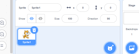
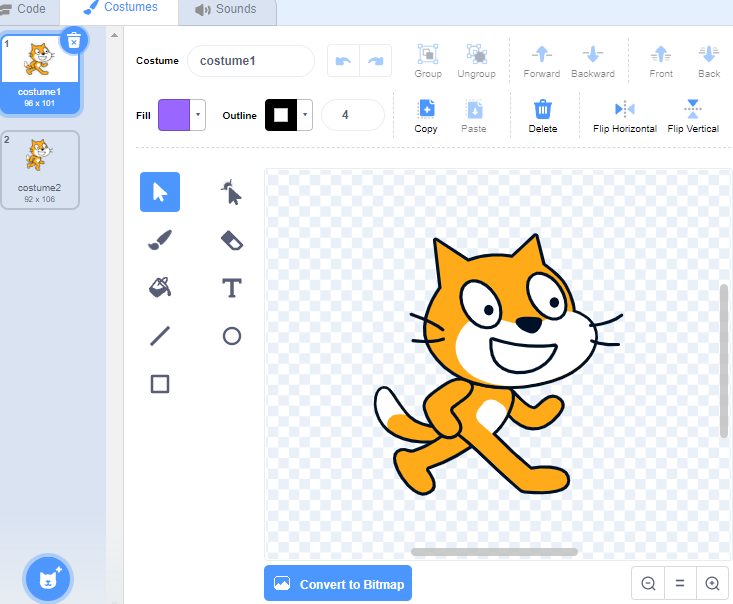
The starter PfP and studio image are both also still blue, though this could be a tough fix.
- Rosics
-
 Scratcher

500+ posts
Color Consistiencies in Accessibility Update List

2.0 Search bar highlight is blue.
- Rosics
-
Scratcher
500+ posts
Color Consistiencies in Accessibility Update List
The starter PfP and studio image are both also still blue, though this could be a tough fix.Wrong, just change the image file the API sets when making a new studio or account.
- littlehand3
-
 Scratcher

48 posts
Color Consistiencies in Accessibility Update List
The aura around the border is blue bcz it’s a scratch 2.0 page
- p-p-p-p-p-p-p-p-p-p-
-
Scratcher
1000+ posts
Color Consistiencies in Accessibility Update List
The aura around the border is blue bcz it’s a scratch 2.0 pagebut 2.0 scratch pages still have purple.
- ametrine_
-
 Scratcher

1000+ posts
Color Consistiencies in Accessibility Update List
shouldn't this topic be titled color “inconsistencies”?
- pursuiter
-
 Scratcher

100+ posts
Color Consistiencies in Accessibility Update List
When Scratch changed the color scheme from blue and orange to purple and red and to green to dark green, many things were left behind, I know https://scratch-mit-edu.ezproxyberklee.flo.org/discuss/post/7340927/ exists but.. it only shows examples of scratch forgetting to change the purple to blue, but what about pointing out things scratch forgot to change to red and more examples of green to dark green? This suggestion is to point out the errors and suggests a change.
Orange < Red
1. The unread messages span.
Now this one is semi noticeable if they do change it to red, I'm talking about the thing where it's on your messages button and it says “1”, "2', and so on, but it's not #c40, so it should be changed to #c40 to help match with accessibility and the messages page.
2. The border on a textarea that gave an error.
Now this one is noticeable if they do change it to red, I'm talking about the thing where if you put bad words or leave it blank on a 3.0 textarea, it shows an error but the textarea shows a orange border, so it should be changed to #c40 to help match with accessibility.
3. The comment errors.
Now this one is noticeable if they do change it to red, I'm talking about the thing where if you post an empty comment or something goes wrong your commenting to quickly, it shows an error but shows a orange background, so it should be changed to #c40 to help match with accessibility.
Green < Dark Green
4. Studio errors.
Now this one is noticeable if they do change it to dark green, I'm talking about the thing where if you add a project via url or you added it already in a studio, an error but shows a light green background, so it should be changed to dark green to help match with accessibility.
Last edited by pursuiter (Feb. 4, 2025 17:46:12)
- MudkipKappa
-
 Scratcher

100+ posts
Color Consistiencies in Accessibility Update List
Orange is pretty much Scratch's color. I don't think they'll give up that.
As for a change from green to dark green, I seem fine with it.
Semi-support.
Edit: Oh wait I completely forgot that these changes were already in effect but just missed out on, i'm stupid lol
As for a change from green to dark green, I seem fine with it.
Semi-support.
Edit: Oh wait I completely forgot that these changes were already in effect but just missed out on, i'm stupid lol
Last edited by MudkipKappa (Feb. 4, 2025 17:50:48)
- pursuiter
-
Scratcher
100+ posts
Color Consistiencies in Accessibility Update List
Orange is pretty much Scratch's color. I don't think they'll give up that.Remember, the message count in the messages page was orange, they changed that, also the errors for comments that showed up as a tooltip was orange, they also changed it.
As for a change from green to dark green, I seem fine with it.
Semi-support.
- MudkipKappa
-
Scratcher
100+ posts
Color Consistiencies in Accessibility Update List
Sorry I didn't realize what this post what exactly about, edited original post.Orange is pretty much Scratch's color. I don't think they'll give up that.Remember, the message count in the messages page was orange, they changed that, also the errors for comments that showed up as a tooltip was orange, they also changed it.
As for a change from green to dark green, I seem fine with it.
Semi-support.
- BigNate469
-
 Scratcher

1000+ posts
Color Consistiencies in Accessibility Update List
1. These count as bugs, as they are cases where certain things were missed in the update.
2. That makes this a dupe of https://scratch-mit-edu.ezproxyberklee.flo.org/discuss/topic/694234/
2. That makes this a dupe of https://scratch-mit-edu.ezproxyberklee.flo.org/discuss/topic/694234/
- pursuiter
-
Scratcher
100+ posts
Color Consistiencies in Accessibility Update List
1. These count as bugs, as they are cases where certain things were missed in the update.I did mention number 2 in the OP, but it only shows how scratch forgot to change from blue to purple, this suggestion points out the other colors.
2. That makes this a dupe of https://scratch-mit-edu.ezproxyberklee.flo.org/discuss/topic/694234/
- medians
-
 Scratcher

1000+ posts
Color Consistiencies in Accessibility Update List
I think the comment errors could also just use the scratchr2 color, have no idea why it was changed to orange in the first place. Also, the thing that you linked did have stuff besides blue and purple, it was meant for the accessibility update in general.
I think there should be an option to use the scratchr2 blue, as colorblind people and people that often get headaches have stated that the purple has caused issues, and there should be separate block colors for different types of colorblindness as a preset.
I think there should be an option to use the scratchr2 blue, as colorblind people and people that often get headaches have stated that the purple has caused issues, and there should be separate block colors for different types of colorblindness as a preset.
- Discussion Forums
- » Bugs and Glitches
-
» Color Consistiencies in Accessibility Update List