Discuss Scratch

- Discussion Forums
- » Suggestions
- » As a colorblind person, I can't see links
![[RSS Feed]](//mv-ezproxy-com.ezproxyberklee.flo.org/scratchr2/static/__35b9adb704d6d778f00a893a1b104339__//djangobb_forum/img/feed-icon-small.png "[RSS Feed]")
- WindowsAdmin
-
 Scratcher

1000+ posts
As a colorblind person, I can't see links
I just want to say that it's been like 1 year since the blue was changed, i remember it like yesterday
- jackson49
-
 Scratcher

1000+ posts
As a colorblind person, I can't see links
I just want to say that it's been like 1 year since the blue was changed, i remember it like yesterdayIt’s been a year?
- PaperMarioFan2022
-
 Scratcher

1000+ posts
As a colorblind person, I can't see links
I just want to say that it's been like 1 year since the blue was changed, i remember it like yesterdaySure… but what does that relate to to discussion at hand?
- pippy2011eight
-
 Scratcher

91 posts
As a colorblind person, I can't see links
They should jsut add a colorblind mode (and make normal mode blue)
- Dagriffpatchfan
-
 Scratcher

1000+ posts
As a colorblind person, I can't see links
Post bumphttps://ibb.co/ZKrGwNJHi, I stand with you, to help make it easier to explain, I uploaded the images for you
(There's literally no other way for me to upload an image without paying, sorry)
Use this in your Op to show everybody the image
BBcode: (for forums)[img]https://u.cubeupload.com/Dagriffpatchfan/x.png[/img]
- rickrollkitt
-
 Scratcher

17 posts
As a colorblind person, I can't see links
It's hard to explain color to people who can, so I lowered the saturation to try to show you that the purple color is too dark and does not contrast enough with the regular gray text. I can still tell what's a link and what's not after being on here for 8 years, but it's very hard for me to tell because–if taken away the color and set everything to 0 saturation–you can see that both colors have almost exactly the same saturation levels, making it harder for blue-purple colorblind people like me to use Scratch.
https://ibb.co/ZKrGwNJ
(There's literally no other way for me to upload an image without paying, sorry)
man i should have known mossy was colourblind- it’s a little upsetting. i thought purple helped so i kind of stopped complaining (and anyways i’m not colourblind so i don’t get to say anything)- but now seeing this, i guess we were wrong. i think there should be an option where you can choose a colour that’s easier for people.
- medians
-
 Scratcher

1000+ posts
As a colorblind person, I can't see links
man i should have known mossy was colourblind- it’s a little upsetting. i thought purple helped so i kind of stopped complaining (and anyways i’m not colourblind so i don’t get to say anything)- but now seeing this, i guess we were wrong. i think there should be an option where you can choose a colour that’s easier for people.This does not just apply to complete colorblindness by the way, but also blue-yellow colorblindness (tritanomaly/tritanopia, which is what I believe mossy has), and for red-green colorblindness, the purple does not seem to help that much, the purple just looks like a darker blue. And yea, I think it should have been done that way, or the Scratch
Also sidenote, you may still be colorblind, there are people who do not realize this until later because their types are mild:
https://colormax.org/color-blind-test/ (note: colorblindness glasses you see are a scam and this one does not test for tritanomaly/tritanopia)
- medians
-
Scratcher
1000+ posts
As a colorblind person, I can't see links
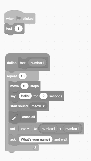
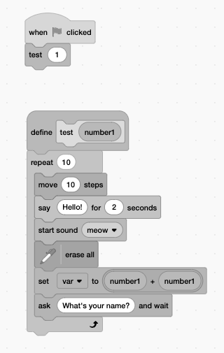
Also, a while back I tried to see what it would look like with different types of colorblindness since I didn't think the pastel colors would really help, and yea (I did this for the purple and color contrast blocks, but I can't really find the purple ones so I just decided to make a new one now (you can see the purple text kind of in the new image)):
I got similar results with other colorblind image viewers, by the way.
High contrast blocks vs Regular:
Regular (protan):
High contrast (protan):
Regular (deutan):
High contrast (deutan):
Regular (tritan):
High contrast (tritan):
Regular (achromatopsia):
High contrast (achromatopsia):
Website Colors (scratchr2 vs purple)
Protan (you can see the purple in the text)
Deutan:
Tritan:
Last edited by medians (July 31, 2024 21:01:29)
- Chrome-Dog
-
 Scratcher

100+ posts
As a colorblind person, I can't see links
Well, its hard to choose the colour, some people cant even see colours.
- medians
-
Scratcher
1000+ posts
As a colorblind person, I can't see links
Well, its hard to choose the colour, some people cant even see colours.Yes, but there are colorblind image viewers that could have been used, and the colors have also made it worse for blue-yellow colorblindness, as explained above, and for other types (most colorblind people are red-green colorblind, or protans/deutans), as you can see above, the colors have not helped (I also have images for the website colors too, to show this is the case for the blue and purple)
Also, the original post kinda showed to you that the update did the opposite of what the Scratch Team said it was created for.
Last edited by medians (July 31, 2024 15:43:05)
- BatoulKouki
-
 Scratcher

73 posts
As a colorblind person, I can't see links
It's hard to explain color to people who can, so I lowered the saturation to try to show you that the purple color is too dark and does not contrast enough with the regular gray text. I can still tell what's a link and what's not after being on here for 8 years, but it's very hard for me to tell because–if taken away the color and set everything to 0 saturation–you can see that both colors have almost exactly the same saturation levels, making it harder for blue-purple colorblind people like me to use Scratch.I think scratch could use a colorblind mode where you could select an option to change the whole website for urself if you're colourblind
https://ibb.co/ZKrGwNJ
(There's literally no other way for me to upload an image without paying, sorry)
- medians
-
Scratcher
1000+ posts
As a colorblind person, I can't see links
I think scratch could use a colorblind mode where you could select an option to change the whole website for urself if you're colourblindIt should use presets (I think it should use the scratchr2 blue, the purple, and colors for each type of colorblindness) but allow you to choose any colors, and allow you to change the size of text (since it would help people with colorblindness, farsightedness, and light sensitivity like said in this YouTube video made by the original poster and the comments, I have heard of many including myself have headaches from the purple)
In fact, in Scratch 2.0, you could change the size and text of the blocks by shift clicking the language icon, I have no idea why this has not been re-added yet.
Last edited by medians (July 31, 2024 21:08:19)
- GoldenApple1000
-
 Scratcher

94 posts
As a colorblind person, I can't see links
wowI just want to say that it's been like 1 year since the blue was changed, i remember it like yesterdayIt’s been a year?
- LilAmongUsMini2024
-
 Scratcher

100+ posts
As a colorblind person, I can't see links
It's hard to explain color to people who can, so I lowered the saturation to try to show you that the purple color is too dark and does not contrast enough with the regular gray text. I can still tell what's a link and what's not after being on here for 8 years, but it's very hard for me to tell because–if taken away the color and set everything to 0 saturation–you can see that both colors have almost exactly the same saturation levels, making it harder for blue-purple colorblind people like me to use Scratch.Can you put the image into a project so that I can see it? I kinda can't really go outside of Scratch much.
https://ibb.co/ZKrGwNJ
(There's literally no other way for me to upload an image without paying, sorry)
- medians
-
Scratcher
1000+ posts
As a colorblind person, I can't see links
Can you see the images hereIt's hard to explain color to people who can, so I lowered the saturation to try to show you that the purple color is too dark and does not contrast enough with the regular gray text. I can still tell what's a link and what's not after being on here for 8 years, but it's very hard for me to tell because–if taken away the color and set everything to 0 saturation–you can see that both colors have almost exactly the same saturation levels, making it harder for blue-purple colorblind people like me to use Scratch.Can you put the image into a project so that I can see it? I kinda can't really go outside of Scratch much.
https://ibb.co/ZKrGwNJ
(There's literally no other way for me to upload an image without paying, sorry)
https://scratch-mit-edu.ezproxyberklee.flo.org/discuss/post/8070341/
The purple can be seen for different types by the way, in the topic, though it does not have a greyscale version for the website yet (there is one for the block colors)
Last edited by medians (Aug. 2, 2024 00:42:28)
- mumu245
-
 Scratcher

1000+ posts
As a colorblind person, I can't see links
The high contrast blocks were designed for low vision, not for colourblindness.
- moss-shadow
-
 Scratcher

500+ posts
As a colorblind person, I can't see links
The high contrast blocks were designed for low vision, not for colourblindness.
It was advertised as colorblind support iirc
- medians
-
Scratcher
1000+ posts
As a colorblind person, I can't see links
I believe it was, I remember it being intended for colorblind people on Scratch Lab.The high contrast blocks were designed for low vision, not for colourblindness.
It was advertised as colorblind support iirc
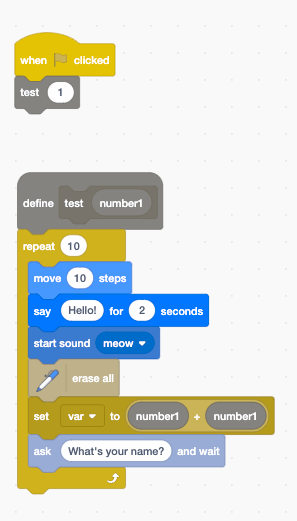
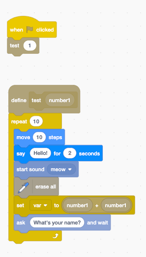
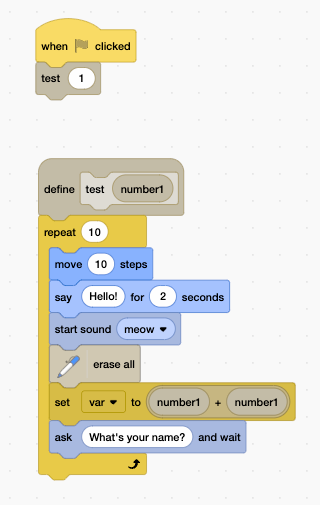
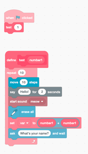
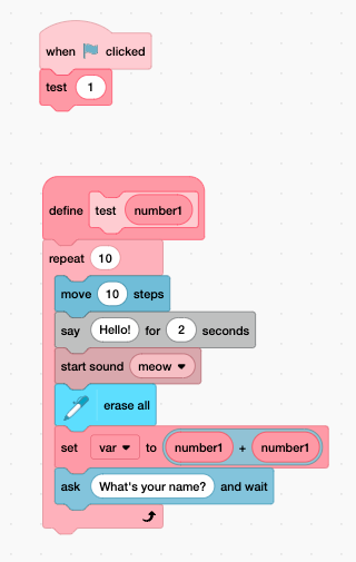
Also, I made some color choices using Edit Block Colors (so can any colorblind people see if it works? These would be presets, and achromatopsia is not included yet)
https://scratch-mit-edu.ezproxyberklee.flo.org/discuss/post/8072378/
Last edited by medians (Aug. 2, 2024 09:27:35)

- moss-shadow
-
Scratcher
500+ posts
As a colorblind person, I can't see links
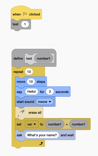
I believe it was, I remember it being intended for colorblind people on Scratch Lab.The high contrast blocks were designed for low vision, not for colourblindness.
It was advertised as colorblind support iirc
Also, I made some color choices using Edit Block Colors (so can any colorblind people see if it works? These would be presets, and achromatopsia is not included yet)
https://scratch-mit-edu.ezproxyberklee.flo.org/discuss/post/8072378/
The Tritanopia one is pretty cool there, but the ( + ) and the (Numbers) do blend in with the purple
- Discussion Forums
- » Suggestions
-
» As a colorblind person, I can't see links