Discuss Scratch

- BringUpYourPost
-
 Scratcher

500+ posts
The Sunglow Color Scheme
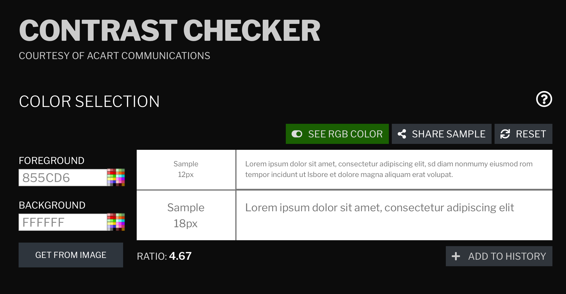
i mean it already does the wcag science stuff
- Slugcat_
-
 Scratcher

100+ posts
The Sunglow Color Scheme
No support for this.. Although yellow and black has very good contrast, it doesn't do so well when its on white.
Links would be hard to see, yes purple is close to black but its way easier to see than a yellow link on a white background.
Maybe it would be good if dark mode and custom website colors were implemented, but for now this is not a great option..
Links would be hard to see, yes purple is close to black but its way easier to see than a yellow link on a white background.
Maybe it would be good if dark mode and custom website colors were implemented, but for now this is not a great option..
Last edited by Slugcat_ (Feb. 29, 2024 21:51:20)

- hydrofungus
-
 Scratcher

1000+ posts
The Sunglow Color Scheme
You didn’t explain the white background and yellow navbar. It’s the biggest problem here, and you just ignore it, and try to act it isn’t a problem
Edit: and also, looking at yellow and black could cause eyestrain for those who aren’t colorblind.
Edit: and also, looking at yellow and black could cause eyestrain for those who aren’t colorblind.
Last edited by hydrofungus (March 1, 2024 09:59:35)
- chippysmall4
-
 Scratcher
1000+ posts
The Sunglow Color Scheme
You didn’t explain the white background and yellow navbar. It’s the biggest problem here, and you just ignore it, and try to act it isn’t a problemThat Is A Disadvantage, Which Most Suggestions Have.
Edit: and also, looking at yellow and black could cause eyestrain for those who aren’t colorblind.
And As Stated Earlier, It Would Be Added Alongside The Reworking Of The Rest Of The Site, So The Site Could Be Revamped To Fit The New Color Scheme.
Last edited by chippysmall4 (March 1, 2024 10:06:21)
- hydrofungus
-
Scratcher
1000+ posts
The Sunglow Color Scheme
Dude answer the upper question, and as i asked an ai…You didn’t explain the white background and yellow navbar. It’s the biggest problem here, and you just ignore it, and try to act it isn’t a problemWhite And Yellow Look Fine(aside from contrast issues)
Edit: and also, looking at yellow and black could cause eyestrain for those who aren’t colorblind.
It's worth mentioning that the brightness and contrast of colors can affect eye comfort. High contrast between black and yellow may cause visual discomfort for some individuals, especially if the colors are used in a way that creates glare or strain on the eyes. However, it's important to consider other factors such as lighting conditions, screen brightness, and individual visual sensitivity.
- hydrofungus
-
Scratcher
1000+ posts
The Sunglow Color Scheme
That Is A Disadvantage, Which Most Suggestions Have.But a very big one that might defeat the entire purpose of color contrast. And how are you so sure they will even “rework” the site with your suggestion? And how will it fit the color scheme? Make the entire website dark mode? Now that could be hard on the eyes when they are in a bright environment.
And As Stated Earlier, It Would Be Added Alongside The Reworking Of The Rest Of The Site, So The Site Could Be Revamped To Fit The New Color Scheme.
Seriously, your suggestion has a “disadvantage” that defeat the entire purpose of your suggestion.
- chippysmall4
-
Scratcher
1000+ posts
The Sunglow Color Scheme
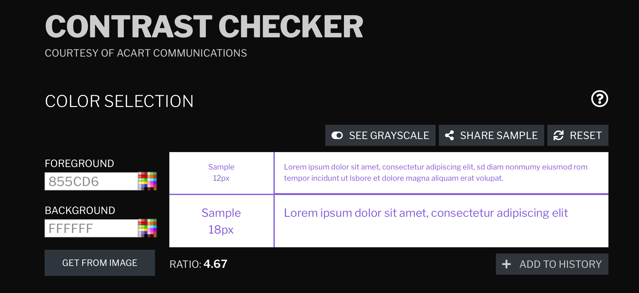
1. Mockup Of The Forums PageThat Is A Disadvantage, Which Most Suggestions Have.But a very big one that might defeat the entire purpose of color contrast. And how are you so sure they will even “rework” the site with your suggestion? And how will it fit the color scheme? Make the entire website dark mode? Now that could be hard on the eyes when they are in a bright environment.
And As Stated Earlier, It Would Be Added Alongside The Reworking Of The Rest Of The Site, So The Site Could Be Revamped To Fit The New Color Scheme.
Seriously, your suggestion has a “disadvantage” that defeat the entire purpose of your suggestion.

2.The Forums (and a lot of the site) Will Be Reworked Eventually, So This Suggests The Sunglow Color Scheme Be Added Alongside The Reworking.
- hydrofungus
-
Scratcher
1000+ posts
The Sunglow Color Scheme
-snip-I did some color contrast checking, and… (i used a grayscale image online to try and simulate what colorblind people see)

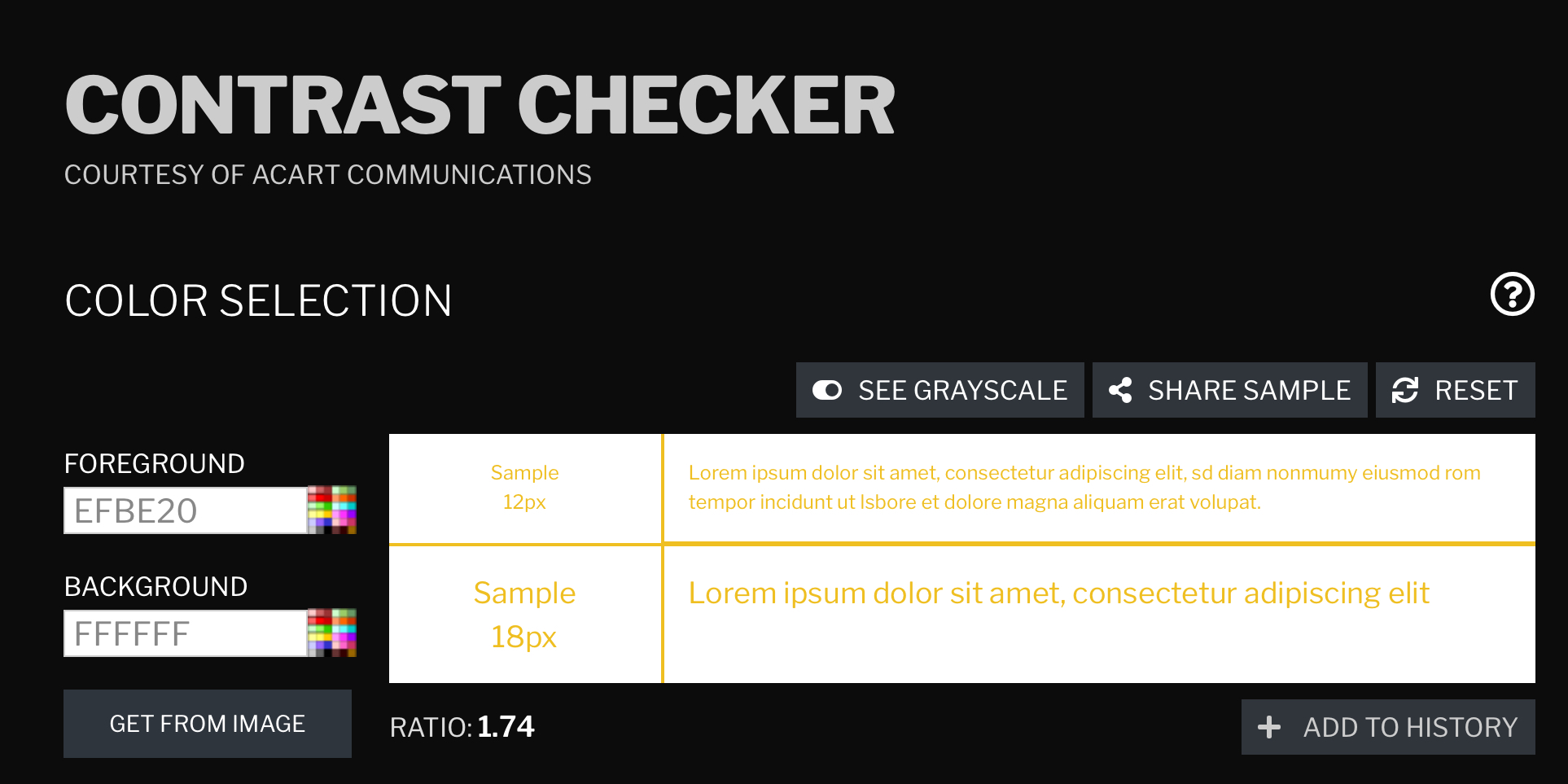
As seen here, the color contrast is even lower than the current one.
Grayscale ver.
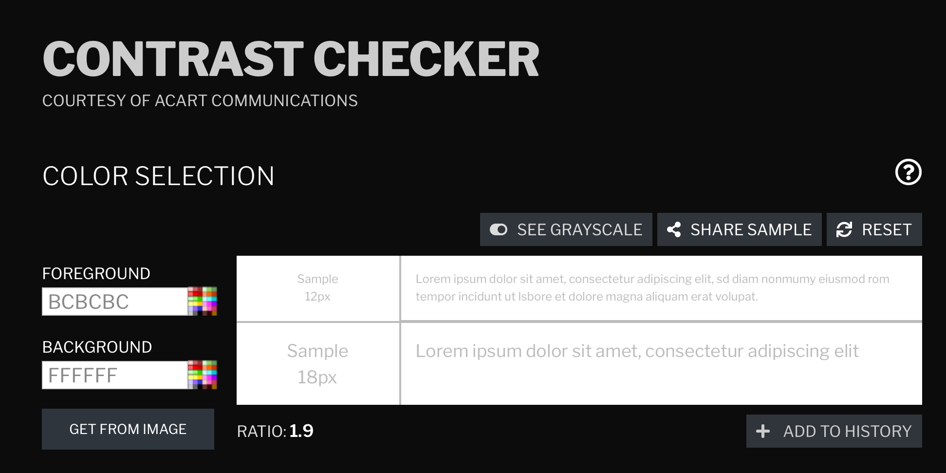
Edit: don’t just go like “oh no but i can still see between gray and white it’s totally accessible!” You aren’t colorblind i think i’m taking a big risk here so don’t judge
Last edited by hydrofungus (March 1, 2024 11:38:52)
- among_us1w2
-
 Scratcher

1000+ posts
The Sunglow Color Scheme
And here is your comparison.i mean its pretty hard to see the white text with a grayscale color filter
black text on yellow (at least on mockup) looks easier to see.
support it wont hurt my eyes
- TheEpikGamer211
-
 Scratcher

1000+ posts
The Sunglow Color Scheme
what about orange, orange is a scratch color.
- starlightsparker
-
 Scratcher

1000+ posts
The Sunglow Color Scheme
Most colorblind people don’t actually see black and white, that’s a very rare color blindness-snip-I did some color contrast checking, and… (i used a grayscale image online to try and simulate what colorblind people see)
As seen here, the color contrast is even lower than the current one.
Grayscale ver.
Edit: don’t just go like “oh no but i can still see between gray and white it’s totally accessible!” You aren’t colorblind i think i’m taking a big risk here so don’t judge
I still don’t support the suggestion tho
Anyways if this suggestion were to happen, goodbye scratch see you never
Last edited by starlightsparker (March 1, 2024 17:43:04)
- starlightsparker
-
Scratcher
1000+ posts
The Sunglow Color Scheme
There are 3 colorblindnesses.
The first one sees purple as some kind of blue, and yellow as a brighter yellow then the original shade
The second sees purple as some kind of green and yellow as some kind of pink
The third is people who see entirely black and white. Purple is pretty dark, and yellow is fairly light.
The first one sees purple as some kind of blue, and yellow as a brighter yellow then the original shade
The second sees purple as some kind of green and yellow as some kind of pink
The third is people who see entirely black and white. Purple is pretty dark, and yellow is fairly light.
- portalpower
-
 Scratcher

1000+ posts
The Sunglow Color Scheme
Looking at the controversy that the purple caused, this does not look that good. The purple change was out of necessity and wasn't even that big of a change from the original palette. Imagine how big of a change this is compared to purple, and how it's not even done for any real reason, it's fair to assume people wouldn't like this very much.
And to be honest, it wouldn't look the best. The purple contrasts nicely with the green, orange, grey, and white found about the UI. This clashes with the orange extremely hard and doesn't look as good with the green. I get changing the green, but I doubt they're going to change the orange, as it's the color of the logo and the mascot.
And to be honest, it wouldn't look the best. The purple contrasts nicely with the green, orange, grey, and white found about the UI. This clashes with the orange extremely hard and doesn't look as good with the green. I get changing the green, but I doubt they're going to change the orange, as it's the color of the logo and the mascot.
- RethinkingVoxels
-
 Scratcher

1000+ posts
The Sunglow Color Scheme
From @hydrofungus's photos, it seems that there is no difference in color contrast. No support.
Last edited by RethinkingVoxels (March 2, 2024 14:56:41)
- chippysmall4
-
Scratcher
1000+ posts
The Sunglow Color Scheme
Put a black and white filter on the mockup, let me see
-snip-I did some color contrast checking, and… (i used a grayscale image online to try and simulate what colorblind people see)
As seen here, the color contrast is even lower than the current one.
Grayscale ver.
Edit: don’t just go like “oh no but i can still see between gray and white it’s totally accessible!” You aren’t colorblind i think i’m taking a big risk here so don’t judge