Discuss Scratch
- PrincessPandaLover
-
 Scratcher
1000+ posts
Merge the two "my stuff" buttons.
No support, I don't see a reason to fix it.
- PrincessFlowerTV
-
 Scratcher
1000+ posts
Merge the two "my stuff" buttons.
Semi support. They are so close together, there is practically no reason to have 2 of them.
- wWSunPandaWw
-
 Scratcher
1000+ posts
Merge the two "my stuff" buttons.
Support, we don't need two. I suggest that the one in the NAVBAR BE REMOVED (I completely changed my opinion) so it frees up space.
Last edited by wWSunPandaWw (March 23, 2018 19:10:58)
- Nero-Guineadoq
-
 Scratcher
50 posts
Merge the two "my stuff" buttons.
Support. There is no reason for two buttons. In three years, I've clicked the one in the dropdown zero times.
- pinkieofthepies
-
 Scratcher
500+ posts
Merge the two "my stuff" buttons.
i dont really support this, there is really nothing wrong with it, although it i had to choose which one to loose, i would loose the one on the navigation bar. i always use the dropdown menu.
- Haz-_-
-
 Scratcher
500+ posts
Merge the two "my stuff" buttons.
I don't really see a problem with this
No support why can't we use the menu one and the drop down one?
It's not necessary the menu one is quicker for some people and is the same to the drop down.
No support why can't we use the menu one and the drop down one?
It's not necessary the menu one is quicker for some people and is the same to the drop down.
- hellounicorns2
-
 Scratcher
1000+ posts
Merge the two "my stuff" buttons.
Support! I personally think the dropdown one should be removed, as it is completely unnecessary, and a file button looks kinda similar to the ones found in google drive 

- Botcho_Otkho
-
 Scratcher
1000+ posts
Merge the two "my stuff" buttons.
No support at all, there's no reason to fix it and would bother some users that use the dropdown one instead of the header one and vice versa. Though, if we may really need to remove one of them, I think we should remove the one in the topbar (instead of the one in the dropdown) for two reasons:
- May be a good way to bring it back.
- Mobile users don't have it.
Last edited by Botcho_Otkho (May 10, 2018 20:41:09)
- cinnamon_bun_puff
-
 Scratcher
500+ posts
Merge the two "my stuff" buttons.
No support, some people probably prefer one over the other, and vice versa.
- TheRealNetherBefore
-
 Scratcher
1000+ posts
Merge the two "my stuff" buttons.
Support- it's unnecessary to have both, and those who typically click one could easily learn to click the other without much issue.
- supermonkeycat157
-
 Scratcher
100+ posts
Merge the two "my stuff" buttons.
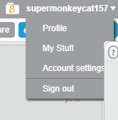
Support! Plus, on the editor, there are THREE my stuff buttons!


- Sheep_maker
-
 Scratcher
1000+ posts
Merge the two "my stuff" buttons.
It's probably like this because the mystuff icon disappears on smaller screens (eg phones) but the messages icon doesn't. Typically the content in dropdowns don't change based on the width of the screen, but the links in navigation bars do. The mystuff link in the dropdown is probably for the phones.
- Haz-_-
-
 Scratcher
500+ posts
Merge the two "my stuff" buttons.
well some people like using both buttons, but getting rid of them? It's unnecessary, I mean whats the point of getting rid of them. For more space?
well there are 2 empty borders on the top left and right, you could add buttons there!
+ Whats the reason of deleting them?
I feel like an opposition team xD
well there are 2 empty borders on the top left and right, you could add buttons there!
Support! Plus, on the editor, there are THREE my stuff buttons!And why removing, those 3 “my stuff” buttons when there are 2 my “save” buttons
+ Whats the reason of deleting them?
I feel like an opposition team xD
- -raspberry_
-
 Scratcher
500+ posts
Merge the two "my stuff" buttons.
Remove one at the top. More space to bring back the discuss button.
- IgDegOo
-
 Scratcher
1000+ posts
Merge the two "my stuff" buttons.
If it ain't broke, don't fix it
Last edited by IgDegOo (March 11, 2018 20:05:39)
- radishboy
-
 Scratcher
100+ posts
Merge the two "my stuff" buttons.
Support. They got rid of the Discuss button because it took up too much space. Why not remove the extra my stuff button
- Haz-_-
-
 Scratcher
500+ posts
Merge the two "my stuff" buttons.
Remove one at the top. More space to bring back the discuss button.Welll the top right andleft borders have tons of space…


