Discuss Scratch
- Discussion Forums
- » Suggestions
- » The Ultimate Scratch 3.0 Block Style Protest Megathread
![[RSS Feed]](//mv-ezproxy-com.ezproxyberklee.flo.org/scratchr2/static/__35b9adb704d6d778f00a893a1b104339__//djangobb_forum/img/feed-icon-small.png "[RSS Feed]")

- jordan1060
-
 Scratcher
500+ posts
The Ultimate Scratch 3.0 Block Style Protest Megathread
So much hate. I think they're not so bad, honestly the extra padding isn't really affecting me.i agree
Sigton
- jromagnoli
-
 Scratcher

1000+ posts
The Ultimate Scratch 3.0 Block Style Protest Megathread
Then why did you bump it? There's just gonna be more hate.So much hate. I think they're not so bad, honestly the extra padding isn't really affecting me.i agree
Sigton
- stickfiregames
-
 Scratcher

1000+ posts
The Ultimate Scratch 3.0 Block Style Protest Megathread
Events and control have already been mentioned, but I've just noticed how similar operators and pen look too, at least to me. I think we could do with keeping most block colours as they are, although this topic suggests we should change the blues and purples a bit.
- stickfiregames
-
Scratcher
1000+ posts
The Ultimate Scratch 3.0 Block Style Protest Megathread
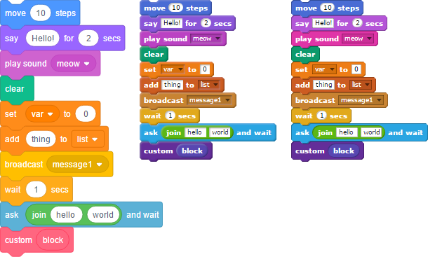
Here are some more thoughts on colours. From left to right are the 3.0 colours, 2.0 colours and my mockup of how the colours could look better.
These are the main difference I can see in 3.0:
- events and control are very similar, and they have swapped so that events is brighter
- pen and operators are somewhat similar, as are data and control
- all data blocks are the same colour, there is no difference between variables and lists
- motion and looks are a bit more different, this might help with the colour-blindness issues I linked in the previous post
- motion is as light as sensing, but sensing has a slight greenish tint
- custom blocks are pink. This is probably the one most people notice and hate the most, although it isn't likely to cause confusion as the other ones might, it's just resistance to change really.
- custom arguments are the same colour as custom blocks. I don't mind this, in fact I didn't even notice they were different in 2.0 for several months.
Last edited by stickfiregames (April 3, 2017 12:36:35)
- WolfCat67
-
 Scratcher

1000+ posts
The Ultimate Scratch 3.0 Block Style Protest Megathread
I didn't think the NitroBlocks could get better, yet there they are! I love the design of the ones on the right.
The thing about Scratch 3.0 blocks that I don't like is that orange seems overused, and seems to clash with practically every background type in my opinion. Just look at what's orange: Control, Events, Variables, and Lists. All block types that we use all the time! It hurts my eyes to look at. The ones on the right of this post are perfect.
Last edited by WolfCat67 (April 5, 2017 00:12:27)
- Greenduck54
-
 Scratcher

500+ posts
The Ultimate Scratch 3.0 Block Style Protest Megathread
Exactly! I started with 2.0 and I like the stage on the right side, i'm just used to it on the right so that'll be annoying (one of my few complaints about 3.0(including the padding and lack of speed/tempo/pitch in the sound effects))I agree, the new blocks are rather ugly… and I just don't think they should change them for 3.0Alright,Also, the if colour block is changed horribly!It's probably still in development, and those are just basic colors.
Now you only have a set amount of colours to use!And, just to end my mini-rant, even though it was this way in 1.4, the right Screen will really bug me as it's not on the left as I'm used to now xPI kind of think it'll be something easy to adapt to. Or, if it isn't, there should be an option to switch between left-side or right-side stages.
- NitroCipher
-
 Scratcher

500+ posts
The Ultimate Scratch 3.0 Block Style Protest Megathread
I didn't think the NitroBlocks could get better, yet there they are! I love the design of the ones on the right.
The thing about Scratch 3.0 blocks that I don't like is that orange seems overused, and seems to clash with the dark blue background in my opinion. Just look at what's orange: Control, Events, Variables, and Lists. All block types that we use all the time! It hurts my eyes to look at. The ones on the right of this post are perfect.
I think that the text input box borders should either acquire a darker version of the block it is is, or have a much darker grey, as it is currently hard to look at. Scratch 3.0 will not have a blue background. That is only present in the vm, not the gui
- Pezd
-
 Scratcher

100+ posts
The Ultimate Scratch 3.0 Block Style Protest Megathread
Maybe you could just have it so when you zoom out, the text doesn't get smaller until it can't fit inside the block. I think that would work for both people who want padding and people who don't.
- stickfiregames
-
Scratcher
1000+ posts
The Ultimate Scratch 3.0 Block Style Protest Megathread
I think that the text input box borders should either acquire a darker version of the block it is is, or have a much darker grey, as it is currently hard to look at.A darker version of the block would be best, I just couldn't work out how to do it.
I also posted this on the colourblindness topic, it has more contrast than default:

- WolfCat67
-
Scratcher
1000+ posts
The Ultimate Scratch 3.0 Block Style Protest Megathread
Ouch, R.I.P. eyes.I think that the text input box borders should either acquire a darker version of the block it is is, or have a much darker grey, as it is currently hard to look at.A darker version of the block would be best, I just couldn't work out how to do it.
I also posted this on the colourblindness topic, it has more contrast than default:
You see, the contrast is good for colourblind people (I guess), but for me the contrast is too great and the colours are too bright, making my eyes hurt.
- stickfiregames
-
Scratcher
1000+ posts
The Ultimate Scratch 3.0 Block Style Protest Megathread
deleted
Last edited by stickfiregames (April 5, 2017 16:25:23)
- Ceo_
-
 Scratcher

500+ posts
The Ultimate Scratch 3.0 Block Style Protest Megathread
Some of you have probably already seen this, but the 3.0 demo is now using the 2.0 colours so it looks like they won't change after all.Nop, this was a “fake”

check the Scratch 3.0 topic, it was a userscript


- Sigton
-
 Scratcher

1000+ posts
The Ultimate Scratch 3.0 Block Style Protest Megathread
The 3.0 blocks are actually pretty pretty…
Sigton
Sigton
- PintOfMilk
-
 Scratcher

1000+ posts
The Ultimate Scratch 3.0 Block Style Protest Megathread
The 3.0 blocks are actually pretty pretty… Horrible
Sigton
- Sigton
-
Scratcher
1000+ posts
The Ultimate Scratch 3.0 Block Style Protest Megathread
Hey most people don't actually realise it's against the rules to misquote othersThe 3.0 blocks are actually pretty pretty… Horrible
Sigton
And is it just because they're a bit taller that you don't like them?
Sigton
Last edited by Sigton (April 8, 2017 12:27:46)
- jordan1060
-
Scratcher
500+ posts
The Ultimate Scratch 3.0 Block Style Protest Megathread
I thought you said pretty and i'm like WHAT!!!!Hey most people don't actually realise it's against the rules to misquote othersThe 3.0 blocks are actually pretty pretty… Horrible
Sigton
And is it just because they're a bit taller that you don't like them?
Sigton
- WolfCat67
-
Scratcher
1000+ posts
The Ultimate Scratch 3.0 Block Style Protest Megathread
The 3.0 blocks are actually pretty pretty…They may look pretty to some, but I think the extra padding is a bit ridiculous. Sure, it may not effect me too much, but I can see peoples' points, and it'll make me feel like I have less room to mess around with in Scratch.
For me, the colours look a little bit too similar to each other. Events and control are almost the exact same and indistinguishable from each other, and variables and lists are literally the exact same colour. I don't like the look of pink on custom blocks; though that may just be my opinion.
I do, however, like the more round-ish look of the editor.
- jordan1060
-
Scratcher
500+ posts
The Ultimate Scratch 3.0 Block Style Protest Megathread
I agreeThe 3.0 blocks are actually pretty pretty…They may look pretty to some, but I think the extra padding is a bit ridiculous. Sure, it may not effect me too much, but I can see peoples' points, and it'll make me feel like I have less room to mess around with in Scratch.
For me, the colours look a little bit too similar to each other. Events and control are almost the exact same and indistinguishable from each other, and variables and lists are literally the exact same colour. I don't like the look of pink on custom blocks; though that may just be my opinion.
I do, however, like the more round-ish look of the editor.
- Discussion Forums
- » Suggestions
-
» The Ultimate Scratch 3.0 Block Style Protest Megathread